Clarkson Typeface
Creative Director Squarespace
Squarespace is one of very few technology companies that can truly call New York City home. The city has inspired our attitude, our aesthetic, and our mission to democratize good design for every ambitious entrepreneur, artist, or visionary with a dream.
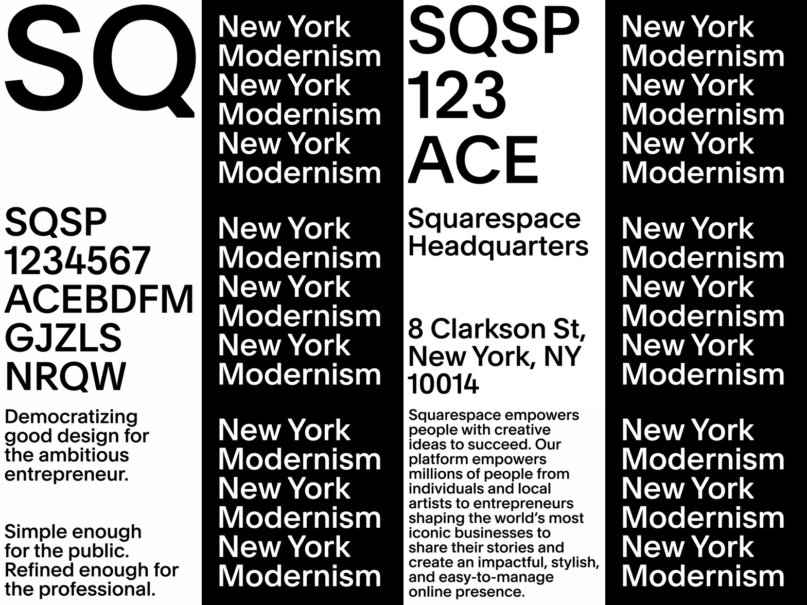
Tasked in creating a new typeface for a tech brand rooted in New York City we partnered up with DIA Studio, François Rappo, and Optimo, to create an entirely new brand typeface, that’s intentionally idiosyncratic, balancing the clarity and sophistication of a neo-grotesque sans serif with the edge formed by thoughtfully cutting the letterforms.
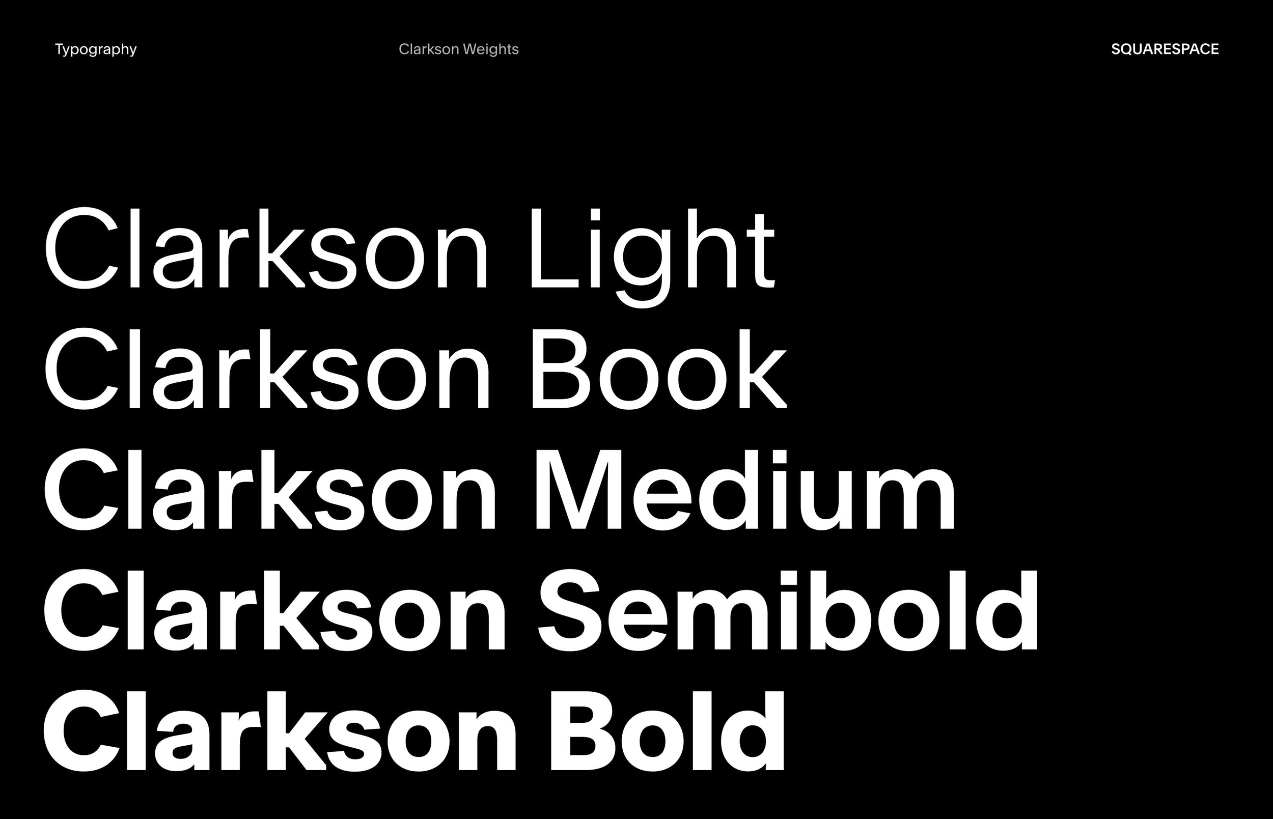
Slightly left off center, it perfectly communicates Squarespace’s New York heritage. Clarkson is a dominant aspect of the Squarespace brand identity and it comes in five different weights to offer a versatile system than can flex and offer expressibility throughout different touch points.


